
Showing posts with label GRAPHIC / PRINT DESIGN. Show all posts

23 July 2015

CUTE GIRLS WITH BIG ROBOTS & RUGRATS

Cartoons are great aren't they? Sexist! but great!

Over the years Deshok illustrations have found them selves being used in all kinds of media:
From WEBSITES, ANIMATIONS and MAGAZINES to FLYERS, POINT OF SALE (POS) and even BIRTHDAY CARDS. Sometimes they can just say more about a company than other marketing solutions.

Looking back at this little collection and I can't help but feel, that although I am happy with my drawing style and the quality of the illustrations, they do seem a little sexist now. For that I apologies : )

Anime, Manga, Deshok, Website design bournemouth
HALLOWEEN PARTY
Night Club special night promotion - Flyers and Posters.

Anime, Manga, Deshok, Website design bournemouth
St VALENTINE'S DAY PARTY
Night Club special night promotion - Flyers and Posters.
Anime, Manga, Deshok, Website design bournemouth
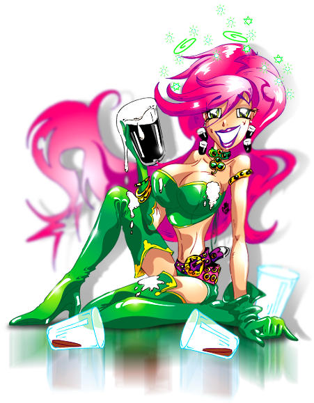
St PATRICK'S DAY PARTY
Night Club special night promotion - Flyers and Posters.

Anime, Manga, Deshok, Website design bournemouth
EASTER BUNNY GIRL PARTY
Night Club Fancy Dress Party - Flyers and Posters.

Anime, Manga, Deshok, Website design bournemouth
MISSFIT PROJECT - the S.H.E. / Natalie
On-line graphic novel character development.


Anime, Manga, Deshok, Website design bournemouth
MISSFIT PROJECT - the S.H.E. / Nadia
On-line graphic novel character development.


Anime, Manga, Deshok, Website design bournemouth
MISSFIT PROJECT - the S.H.E. / Nina
On-line graphic novel character development.


Anime, Manga, Deshok, Website design bournemouth
MISSFIT PROJECT - the S.H.E. / Rachael
On-line graphic novel character development.


Anime, Manga, Deshok, Website design bournemouth

MISSFIT PROJECT - Lusoona Karmoine (Lucy)
On-line graphic novel character development.

Anime, Manga, Deshok, Website design bournemouth
MISSFIT PROJECT - Druid F.L.M.D (Front Line Morale Destroyer)
On-line graphic novel character development.


Anime, Manga, Deshok, Website design bournemouth
MISSFIT PROJECT - Adam
On-line graphic novel character development.


Anime, Manga, Deshok, Website design bournemouth
AMANDA - The TranAm girl
This illustration created for a life-size, free-standing form cut board.


Anime, Manga, Deshok, Website design bournemouth
HAPPY 22nd BIRTHDAY NATS!
This illustration created for a birthday card.


Anime, Manga, Deshok, Website design bournemouth
EUROPEAN CUP 2008
This illustration created for a life-size, free-standing POS board to promote EURO 2008 events.


Anime, Manga, Deshok, Website design bournemouth
GEN, GENIE OUT OF THE BOTTLE
Heigh Steet retail POS, promoting large format full-colour printing.

Anime, Manga, Deshok, Website design bournemouth
FAITH SHOES - Height St brand
High Street shoe brand POS, swing tickets and other similar items.

Anime, Manga, Deshok, Website design bournemouth
THE RUGRATS - Nickelodeon
Branded merchandise for the toys industry. Sold via Argos, Great Universal Toys R Us and other big brand retailers.

Anime, Manga, Deshok, Website design bournemouth
TINY TOONS - B MORE BIZ
Personal improvement and self-help on-line program mascot.


Anime, Manga, Deshok, Website design bournemouth
TINY TOONS
This one is just for fun!

9 July 2015

SOS LYNX.ORG: TO RAISE AWARENESS FOR THE PLIGHT OF THE IBERIAN LYNX

THE HOME PAGE. EVERYTHING YOU NEED RIGHT FROM THE HOME SCREEN.
PORTUGUESE VARIANT

- BRIEF -

SOS Lynx.org is a Portuguese organisation whose mission is to raise awareness for the plight of the Iberian Lynx. At the beginning of this project it was estimated that only 150 Iberian Lynx were left in the wild; the boys and girls at SOS lynx wanted to do something about that. Initially the brief was simple: tell the world, raise awareness and collect lots of donations.

- THE GOAL -
Apart from raising awareness for the terrible drop in the wild population of the Iberian Lynx over the past 20 - 30 years, what did SOS want to achieve? The main reasons for this decline were already known, but a plan of action needed to be decided and then acted upon. Although this is beyond the scope of this case study, a captive breeding campaign was initiated alongside government lobbying with regard to Cork producers, and land was set aside to reinvigorate the rabbit population (rabbits being favoured prey of the Lynx). Also a hearts and minds campaign aimed toward local farmers was established to create habitat corridors in the hope of connecting up isolated populations separated by human encroachment.
SOSLYNX PRINTED ASSETS. PRESENTATION FOLDER, STATIONERY, BUSINESS CARDS

ASSETS REQUIRED

• Corporate ID
• Stationary
• Business cards x 4 types
• Corporate folders
• Merchandise designs
• Website (Awareness & Fundraising)

- THE BRAND -

The brief for the new brand was a list of things it would need to do, as opposed to the message we wanted to send, the goal we wanted to achieve or the emotions we wanted to evoke. The wish list was long and technical and would not be possible with one logo, but versions on a core theme would do the trick. The logo needed to include an image recognisable as the Iberian Lynx. It needed to work in full colour and black and white, in print as well as online and lend itself well to big promotion, exhibition materials, posters, promotional items and clothing. So this is how it was to be used, but what did it need to do? Firstly it needed to attract the attention it needed to inspire interest and sympathy. This would then lead on to the wider mission; to create awareness, encourage donations and for people to sign a petition or lobby an MP.


SOS BRAND, 1ST  FULL COLOUR, 2ND BLACK & WHITE POSS
The logo, incorporated within various promotional materials would ultimately lead interested parties to the website where the rest of the work could be done. It was at this point that the organisation became known as SOSLynx.org as opposed to plain old SOS Lynx. This was a small modification, but one that was cutting edge at the time - basically making the logo the domain name and the domain name the logo.
This logo was crying out for a motif to really hammer home measure. We opted to steer away from the sympathy or cute vote and decided on an image that was dynamic, majestic and purposeful. This was an animal on the brink, but which was not going to take it lying down; it was going to fight for its existence. 
The motif was based on a favourite photograph that had already seen plenty of PR action and therefore already had a strong recognition. The logo motif started with this photograph and was then traced by hand to create the 4 colour spot logo. This was vector based artwork so the logo could be resized and used for everything on the client’s wish list. After this a greyscale version was produced as well as simplified positive and negative silhouettes. Just 4 versions of the logo created in an ultimately scalable format, fulfilled the client’s criteria perfectly.

- CONCEPT / THE CREATIVE SITE -

By now we were quite attached to this project and the people running the organisation, so we decided to put a little more time and effort into this project than was budgeted for.

WEBSITE REQUIREMENTS:

•Multimedia presentation
• Inform the world of the situation and mission 
• Prominent donations page powered by PayPal
• Information porthole for downloadable .pdf monthly updates, press releases and media kits
• Photographic Gallery
• Video gallery
• SOSLynx merchandise page powers by CafePress
• Animated introduction
• Doomsday countdown clock with dynamic calendar
• Dual language options, Portuguese and English

SOS NEWS PAGE PROMINENTLY FEATURING DONATION BUTTON
We decided to build an F/S (Fullscreen) enabled interface, this meant that no matter the size of the monitor used for browsing, the website would fit full screen. Considering the importance of the project this site was deliberately kept simple with key feature sections being easily accessible from the home page. A multimedia solution was developed and built completely with Adobe Flash which would give us the scope to fulfil the client’s wish-list and build a completely seamless experience including; sound, music, video and animation as well as eliminating the need to download widgets or open content in other browser windows or websites.


MEDIA HOME SCREEN FEATURING PHOTOGRAPHY & VIDEO GALLERIES
PHOTOGRAPHY GALLERY READY TO PLAY SLIDE-SHOW
On visiting the site visitors are presented with an animated introduction to set the mood and to divulge key information. This animation was actually extrapolated from the site and used during press conferences and played as a loop during TV interviews, both in the UK and in Europe. Particular attention was given to the gallery and video player. We had several videos to serve up and all are played in a clean and simple custom media player. Rollover the screen and the play button is revealed, rollover it again and the pause/stop button comes into view. The same media player technology was used to serve up the photo gallery. This included several additional cool functions, custom built just for SOSLynx. The Donation page is accessed via a very prominent link above the main content windows. This was designed to be easily accessible from every page. For the purposes of budget the PayPal online donation system was used.


ENGLISH HOME PAGE WITH WITH LINK TO PORTUGUESE VARIANT
This is a Portuguese issue, but interestingly the English version of the site was created first with Portuguese following after. For the purpose of budget and limitations of the technology with regard to the websites design and text layout this was built manually.

- THE RESULTS -

This website became a worldwide source of information on this subject and was featured in television interviews and magazine articles etc.  In one day SOSLynx received over 230,000 unique visitors and continues to generate online donations. We are very proud that this website is a multi award winning project, including 2 Website of the Day Awards.

LET'S TALK
ABOUT WHERE YOU WANT YOUR BUSINESS TO GO NEXT
CALL +44 (0)1202 388538 OR EMAIL: INFO@DESHOK.COM

3 November 2014

HERMES: HIGHLY ENCRYPTED RAPID MESh COMMUNICATION SYSTEM

WELCOME TO HERMES
THIS PROJECT WAS OPTIMISED FOR PRESENTATION EXCLUSIVELY ON A LAPTOP


 BRIEF

This 5G communications system was named Hermes after the God of transitions and boundaries. Hermes was quick and clever and moved freely between the worlds of the mortal and divine, as emissary and messenger of the Gods. This then was the perfect name for this LMDS (Local Multipoint Distribution System) that was set to revolutionise comms in dangerous, hazardous and difficult terrain, including warzones and natural disaster environments.

The brief was to create a brand for this product, ready for meetings with investors in 7 days time. Required was brand development to include multiple formats i.e. short-fat, long-thin. The brand also needed to be developed for full colour and black and white uses, both positive and negative. They needed it to be presented as spec sheets showing the brand in its different formats.
An 8pp corporate brochure designed and 16 off copies printed was also required, along with an 8pp website including an animated Flash introduction.

THE GOAL

To create a look, feel and image for a product that at the time was by all accounts, a suitcase full of technology. We wanted to create the impression of dynamism, speed and leading edge technology, appropriate to defence and emergency services.

In this case there wasn't any time for a plan of action. We had to fly by the seat of our pants, drawing on instinct and experience where we could.

ASSETS REQUIRED:

• Brand development
• Corporate brochure 8pp and delivered in print
• Website 8pp

THE BRAND

HERMES BRAND REFERENCE (mythology.wikia.com)
For this project and with the deadline looming, the first go-to was classical Greek iconography for the deity ‘Hermes’. Research was quickly conducted and a custom hand illustration produced in-house. This included all the elements to identify the illustration as Hermes, but in the form of a simple silhouette in action, with almost comic book and heroic qualities.


HAND DRAWN, VECTOR-BASED ILLUSTRATION VIA AI
HERMES BRAND, BLACK AND WHITE, POSITIVE (B/W-POS)

HERMES BRAND, BLACK AND WHITE, NEGATIVE (B/W-NEG)

HERMES BRAND, FULL COLOUR, NEGATIVE (CMYK/RGB-NEG)

After very quick development this was then re-created in a vector based, digital format. This would allow us to do what we needed with the icon. For the full colour treatment, we took it into Photoshop and created and applied a metallic chrome effect combined with bevels and a minimal drop shadow, this gave it the desired look of molten quick silver. A second layer, a mesh effect was applied as a tint, giving the logo a feeling of robust digital technology and speed. The contrast against a black background, with subliminal honeycomb MESh texture completed the full colour treatment.

THE BROCHURES


Due to the longer lead time from design to finished artwork and print, the brochure needed to be next on the agenda. A simple bullet-point design was used for the page layouts, minimising the time to write copy and to set for artwork. Established devices such as the logo and the black colour way were used for the cover, but the more conventional, easier to read styling of black text on white was used for the content. A honeycomb graphic for page backgrounds was created in a 3D application and applied throughout the brochure to reinforce the MESH technology theme. Artwork was delivered to the printers by hand, printed overnight and ready for pick-up and delivery the next day.

CONCEPT / THE CREATIVE SITE


The look and feel for the website had been established with the brochure design and it was just a case of reimagining it to a computer friendly, landscape format. A crowd pleasing animated intro took the largest part of the website development, as it would give the presentation something of a wow factor. It predominately featured the Hermes logo and the honeycomb MESH which featured information pulsing through the MESh network.


The layout of content pages followed the theme of the brochure, with the Hermes logo, mission statement and strap-line visible from all pages within the site. The main navigation for the website was by way of a simple horizontal menu, always on view at the top of the page. A secondary web wizard "Next Section" button was included at a later stage, as this aided the demonstration of the site on a laptop.

THE RESULTS

All aspects of the project were completed on time and handed over to the client ready for next stage development. The project was deemed to be 100% successful with the designers of the Hermes system sufficiently impressed with the concept, implementation and speedy turn-around of the presentation, to enable our client to take the Hermes project to the next successful outcome.

In this case it was not appropriate for this data to be made available.

Related Links:
http://hermes.deshok.com

1 August 2014

FIA2014 - Print isn't dead after all. A7, 4/1, 8pp

A7, 4/1, 8PP, INCLUDING WALLET, BUSINESS CARD AND
A DESHOKED CARABINA KEYRING AS A KEEPSAKE
FIA IS A MUST GO
The Farnborough International Airshow (FIA2014) is a must go every year, to keep up-to-date with new technology, meet with friends, colleagues, clients and generally hang-out with like minded businesses that love the industry too.

SOME GENTAL BRAND AWARENESS
This year we didn't go empty handed and put together these mini company brochures, along with a deshoked carabina keyring and business card. The mission was some gentle brand awareness and to promote the specialist digital agency service for the aerospace industry. The smaller formate of the brochure meant they were light and convenient to carry around but more importantly, also easy for recipients to slip into a pocket or brief case.

FINISHED ARTWORK SPREAD READY TO GO TO PRINT
2 VERY STRONG BUSINESS LEADS ALREADY
This mission was more successfully then we could have every hoped for, In the end we only managed to hand out 62 of them but a little less then 2 weeks after the show we have had 2 very strong enquiries and have meet with one of the companies already. It looks like print isn't quite dead after all. Very pleased.

FARNBOROUGH AIRSHOW SF-SPAN
FIA SPLASH PAGE 2014
If you would like one email your address to: info@deshok.com and we'll drop one in the post for you.
For more about Deshok visit the website at: www.deshok.com or google search "deshok".

30 October 2013

DESHOK MARKETING ASSETS - "CAMOSHOK".


Over the the past months Deshok has been going through a bit of a brand transformation, most of which is a beyond the scope of this post but as part of this re-branding exercise I decided that I would like to create a texture that can be used as a background in a multitude of circumstances. 

This texture could be used as cover for brochures or the background for a business card, computer and website wallpapers or even wrapped around a Mini! I had a little play with visuals such as sheet steel, rusty metal concert and carbon fibre in the end I settled on camouflage or to be more specific, MultiCam. This is the bang up-date-to-date camo that is currently issued to to the British army in fact it is issued to all major armies keen on keeping their personal safe.

Just to copy the existing and © Copyrighted MultiCam was not an option, I wanted to put a slight Deshok twist to it.


So how did I do this?
Firstly and using some genuine MultiCam as a guide, I drew out all the elements of the camouflage in AI, creating a layer per colour, 5 in total. This was longest part of the project but I felt important to get right.


You will notice that I have included the Deshok brand to some of the colour layers.


Above is quite close to the original MultiCam colour ways. This didn't seem right for my purposes.  


Next? colours.
To start with and so I had visual base to work from I used close to the original colours. The finished item did not look right for my needs at all so in the end and after much faff I decided on subdued olive green hues. This works very well with white Deshok brand and the orange of the Deshok skills icon set and the Gut "N" Glory crest.


As this was produced as a vector based AI illustration I can enlarge and scale as much as I need and it will always look great. Like -wise, it can easily be dropped into Photoshop and saved out as .jpg .png . eps etc for use on line and off-the-page.


Above a test piece to see how it will look in action.

Find out more about genuine MultiCam visit the MultiCam site at the link below.

Related links:
www.multicampattern.com

10 October 2013

DPM - DISRUPTIVE PATTERN MATERIAL: AN ENCYCLOPEDIA OF CAMOUFLAGE


It seems like a thousand years ago now but I used to visit this cool street fashion shop in Bournemouth and moon over a book they had there, called: DPM - DISRUPTIVE PATTERN MATERIAL: AN ENCYCLOPEDIA OF CAMOUFLAGE by Hardy Blechman head designer at maharishi, a company he founded in 1994.


A beautiful object but at £400 a bit out of my budget. But why so expensive? I suspect it was limited edition with a small print run and the production values were beautiful. Full colour though out many many spot colours, Matt laminated with spot UV varnish. This was a coffee table book of 2 parts and came in beautiful box to protect your investment. I have been able to find the book for sale on Amazon usually pre-owned and going for upwards of £1400 mint condition you understand but you see what I mean by investment.


DPM : Disruptive Pattern Material is Hardy Blechman’s exploration into the vast world of camouflage, drawing on the knowledge of an extensive team of consultants the encyclopedia charts the history and theory of camouflage from its original concept in nature, through to its adoption by the military and on to its popularity and use within modern civilian culture. So if anyone is looking for an excellent birthday or Christmas gift idea here you go, other than that, Id better start saving my pennies.

Related links: