23 October 2015

B.E.C. GROUP BRING LIFE TO CONCEPTS IN PLASTIC

BEC GROUP WEBSITE HOME PAGE, F/S ENABLED

- BRIEF -

The BEC Group is an internationally focused, plastic engineering company, based on the border of the New Forest National Park in southern England. They approached Deshok with quite a common problem. They had customers, but were beginning to see that existing methods of marketing were no longer as effective as they used to be. However great and long-lived a client relationship is not forever; historic customers were beginning to wane and new custom was not maturing quickly enough to take-up the slack.

- THE GOAL -

BEC Group wanted a clear and robust route to new customer acquisition for the purposes of attracting new clients and building/maintaining new relationships.  The secondary mission was to provide a real and more local alternative to China, with regard to product design, prototyping and tool making.

BEC Group had recognised the need for a shift in marketing strategy and had already decided on a well researched plan-of-action.

Rigorous T2T and T2C (trade-to-trade) / (trade-to-customer) advertising via internet based portals, to build up an initial momentum. Followed up with SEO (search engine optimisation) and SEM (search engine marking) to continue this momentum and eventually ease up on the T2T / T2C advertising, with the hope that organic search results will eventually takeover.

ASSETS REQUIRED:

BEC Group pointed out concerns that the existing BEC Group identity was dated and in need of a refresh. This included:

• Brand and company ID refresh 
• New factory signage 
• Company stationary 
• Off the page assets, such as company brochures, folders and technical information templates

This was to all be kicked off with a brand new website design and implementation, with a style template that could be easily reimaged as identity and multiple format advertising assets for trade-to-trade marketing portals. 

- THE CONCEPT -


"We just want to bring life to plastic"!

BEC Group had done their research and had already come to the conclusion that they liked the Deshok style and so requested that we come up with concepts.

In this case (as with most), the personal meeting with the Board of Directors was paramount. The concept that was decided upon was based on a throw-away comment made by the MD: "We just want to bring life to plastic".

We were provided with the following wish list:

1. Dynamic
2. Multimedia
3. Animation
4. Different
5. Stand-out
6. Better than our competition
7. Industry specific and general appeal
8. To appeal to designers who want a partner for prototyping
9. To inspire a strong alternative to China 

- THE BRAND -

The BEC Group brand had almost 30 years of history and was well known to customers and the plastics industry around the world. Therefore a complete rebrand was not recommended.

BEC BRAND IN PROCESS OF BEING RE-DRAWN

In short we were instructed to: improve it, modernise it, but not to change it.


It was established that the new colour scheme for the brand would be black, steel and neon green, then it was a case of tidying up the logo, giving it a little nip and tuck, applying the new colour ways and giving the logo some form i.e. making look like it could be made from steel as opposed to a photocopy.


BEC GROUP REBRAND - NEGATIVE / FULL COLOUR TREATMENT

BEC GROUP POSITIVE / BLACK &WHITE

The steel of the BEC Group represents the steel of a mould tool; the neon green represents the injection of plastic into the mould and the black that the whole operation is undertaken with precision and care. These logo devices were already there, but applying the new colours in this way gave what was already established meaning and a story.

- CONCEPT / THE CREATIVE SITE -

How to bring life to plastic? That was the question - obviously not possible in real life, but on a computer with CG 3D animation? We can do something with that.
We came up with the idea of a multimedia website that could include animation, sound effects and music etc. We thought how great would it be if we had a Toy Story Buzz Lightyear character who could walk around the site and present pages and items. But was a robot / spaceman right? We kept thinking... a spaceman became an action man; this then became a Barbie doll who then became BECy. BECy would be the BEC Group’s very own mascot; she would be designed just for them, incorporating their brand identity and of course practical for CG 3D animation.

This concept was to have a first stage presentation in the form of broad features, key phrases and pages of the site i.e. the Home page, About us etc. these were mocked up as stills keeping cost to a minimum. Bearing in mind the client had no idea what were where to present or if they would even like the idea, we didn't waste time creating the BECy character just yet. Instead we used an off-the-shelf action figure to illustrate the concept.


MENU SYSTEM X3 STATES. DORMANT, ABOUT US SELECTED & CONTACT US SELECTED
The meeting was a success the client loved it, but we weren't to get things all our own way. The MD asked “can I have a menu system that looks like an Engine Start button?” So a circular menu system then! This took us about a week to develop, eventually hitting the idea of having the website page categories arranged around the Contact Us button in a ring of 4, with a ring of 8 on the outside. Having the buttons arranged in a ring presented their own problems, but we opted to build the menu graphics in an illustration program before converting them to .png images with transparent backgrounds in Photoshop, before dropping them in to yet another program to apply animation and effects. 
In the end the BECy character was dropped for the purposes of diverting the budget needed to develop it thorough to digital channels of advertising. Ironically this notion was Deshok inspired after research demonstrated that dropping BECy would have minimal effect on click-through rates, whereas increasing the advertising budget would benefit this. In short, the website was just fine without her.


ABOUT US PAGE
CONTACT US PAGE FEATURING A WEBFORM
- THE RESULTS -

Momentum for the new project was pretty quick to pick-up. Within four months of the launch BEC were confident to say that on average they had 4 new enquiries per week, of which 1.5 projects would convert per month. The average spend per enquiry was £23,000 - the initial budget for the project was £10,000 split 50/50 between website design and other marketing assets such as digital channel adverting. So BEC were projecting to achieve £276,000 of extra revenue for the initial outlay of £10,000! 

Recently while discussing a new project with the MD he suggested that it was this work that we did back early 2007 that helped BEC to work through the 2008 /2013 recession in good order. It also should be mentioned that during the height of the campaign BEC consistently achieved high rankings with digital advertising and excellent page 1 results for search terms using Google.

23 July 2015

CUTE GIRLS WITH BIG ROBOTS & RUGRATS

Cartoons are great aren't they? Sexist! but great!

Over the years Deshok illustrations have found them selves being used in all kinds of media:
From WEBSITES, ANIMATIONS and MAGAZINES to FLYERS, POINT OF SALE (POS) and even BIRTHDAY CARDS. Sometimes they can just say more about a company than other marketing solutions.

Looking back at this little collection and I can't help but feel, that although I am happy with my drawing style and the quality of the illustrations, they do seem a little sexist now. For that I apologies : )

Anime, Manga, Deshok, Website design bournemouth
HALLOWEEN PARTY
Night Club special night promotion - Flyers and Posters.

Anime, Manga, Deshok, Website design bournemouth
St VALENTINE'S DAY PARTY
Night Club special night promotion - Flyers and Posters.

Anime, Manga, Deshok, Website design bournemouth
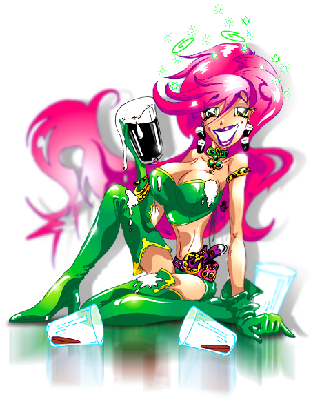
St PATRICK'S DAY PARTY
Night Club special night promotion - Flyers and Posters.

Anime, Manga, Deshok, Website design bournemouth
EASTER BUNNY GIRL PARTY
Night Club Fancy Dress Party - Flyers and Posters.

Anime, Manga, Deshok, Website design bournemouth
MISSFIT PROJECT - the S.H.E. / Natalie
On-line graphic novel character development.


Anime, Manga, Deshok, Website design bournemouth
MISSFIT PROJECT - the S.H.E. / Nadia
On-line graphic novel character development.


Anime, Manga, Deshok, Website design bournemouth
MISSFIT PROJECT - the S.H.E. / Nina
On-line graphic novel character development.


Anime, Manga, Deshok, Website design bournemouth
MISSFIT PROJECT - the S.H.E. / Rachael
On-line graphic novel character development.


Anime, Manga, Deshok, Website design bournemouth

MISSFIT PROJECT - Lusoona Karmoine (Lucy)
On-line graphic novel character development.

Anime, Manga, Deshok, Website design bournemouth
MISSFIT PROJECT - Druid F.L.M.D (Front Line Morale Destroyer)
On-line graphic novel character development.


Anime, Manga, Deshok, Website design bournemouth
MISSFIT PROJECT - Adam
On-line graphic novel character development.


Anime, Manga, Deshok, Website design bournemouth
AMANDA - The TranAm girl
This illustration created for a life-size, free-standing form cut board.


Anime, Manga, Deshok, Website design bournemouth
HAPPY 22nd BIRTHDAY NATS!
This illustration created for a birthday card.


Anime, Manga, Deshok, Website design bournemouth
EUROPEAN CUP 2008
This illustration created for a life-size, free-standing POS board to promote EURO 2008 events.


Anime, Manga, Deshok, Website design bournemouth
GEN, GENIE OUT OF THE BOTTLE
Heigh Steet retail POS, promoting large format full-colour printing.

Anime, Manga, Deshok, Website design bournemouth
FAITH SHOES - Height St brand
High Street shoe brand POS, swing tickets and other similar items.

Anime, Manga, Deshok, Website design bournemouth
THE RUGRATS - Nickelodeon
Branded merchandise for the toys industry. Sold via Argos, Great Universal Toys R Us and other big brand retailers.

Anime, Manga, Deshok, Website design bournemouth
TINY TOONS - B MORE BIZ
Personal improvement and self-help on-line program mascot.


Anime, Manga, Deshok, Website design bournemouth
TINY TOONS
This one is just for fun!

10 July 2015

THE ART OF THE SELLABLE HEADLINE


Here is a question for you, what does your company do?

Can you tell me? have you taken the time to think about a snappy answer to a question that we get asked all the time?
If you can then you have sellable headline for your company.

In business it can be the smallest most unimportant things that can make the difference:

There are many important assets a company needs but one that is so often over looked is the sellable headline.

The sellable headline is simple, short paragraph that describes your company and is very usefully for pitches, dinner parties, exhibitions and all those other "And what do you do?" moments. The Sellable headline is not to be confused with a strapline or a tagline, a slogan or a moto. Here are some instances of what a sellable headline is NOT:

TESCO "Every little helps".
VODAPHONE "Power to you".
AUDI "Vorssprung Durch Technik".

And my personal favourite from a TV campaign about a million years ago;

RADIO RENTALS "You'll be glued to our sets not stuck with them".

Straplines and slogans etc can be temporary and for the purpose of an advertising campaign and helping customers to remember a brand. What we are discussing here is a short, pithy easy to understand description of your company.

FOR INSTANCE

My company is a digital agency and we design and build Internet based systems that can help companies in the defence industry to communicate better with their clients and with other business. Lovely but this doesn't get to the point and doesn't tell people what we do in a way that is easy to understand and quick to get across, our sellable headline therefor is; 

"Deshok is a Specialist website & digital design agency for Aerospace, Defence & Security sectors U.K."

OK not so pritty but it doesn't have to be this is not a slogan it not a catch phrase but in many ways more important, it includes what we do, the benefit, who should be interested in the service, where we're from and where we like to do business. We use this everywhere from our website to our business cards to email signatures, and without playing games and being clever, it makes it easy to understand, it doesn't make people feel stupid it just tells people what we do.

Being able to describe what you do seems like a simple thing until someone asks you to do it. But why does it matter?

WINNING THE PITCH

In the process of my job I have meet a lot of businesses old and new and it is imperative that I understand what the company does other wise how can my company build a website for instance that informs the visitor? Quite often it would be easy to come away from a client brief and be none-the-wiser as to what the company does. This is usually because the company owner knows the business inside out, they know them selfs exactly what the company does but just can't describe it a way that anyone else can understand. So in my case, if not careful it can lead to a poor website design, probably leading to a lot of work to put it right, or in a more extreme case not being able to get an angel invested, not winning the pitch for next stage of your business start-up development.

NOBODY APPRECIATES ME!

I have a friend who works in banking but beyond that no one, not even his wife knows what he does. The other evening he said to me that nobody appreciates what he dose, I told him it was because no one understood what he dose to be impressed by it, and he still couldn't tell me what he does : )

The sellable headline is a small thing to fix and perhaps for this reason no one really discuses it, it's not that important until it is critical.

SO HOW TO SORT YOUR SELLABLE HEADLINE

4 simple rules;

1. Who you are
2. What you are
3. The benefits 
4. Where you are

So in the case of my company:

Who you are - Deshok website and digital design agency
What you are plus benefit - a specialist service for aerospace, defence and security 
Where you are - U.K.

THIS IS IMPORTANT

This is worth thinking about and having it prepared in your mind for when it is need.
It can simply mean the difference between getting the deal or not. Unbelievably as small as it is, it can be that important. You can use it as much as including it on your business cards or as little as simply having it prepared, in the forefront of your mind; for when the interested ask... What does your business do?

Well now you can tell them : )


CtA - LEAVE A COMMENT, COME BACK SOON.


Deshok is a small but well informed digital agency
very capable of delivering big things on a global stage.
To find out more about Deshok visit: www.deshok.com

When you're ready, CONTACT Deshok and let's talk about
where you want your business to go next.

CALL: +44 (0)1202 388538 - EMAIL: info@deshok.com

9 July 2015

SOS LYNX.ORG: TO RAISE AWARENESS FOR THE PLIGHT OF THE IBERIAN LYNX

THE HOME PAGE. EVERYTHING YOU NEED RIGHT FROM THE HOME SCREEN.
PORTUGUESE VARIANT

- BRIEF -

SOS Lynx.org is a Portuguese organisation whose mission is to raise awareness for the plight of the Iberian Lynx. At the beginning of this project it was estimated that only 150 Iberian Lynx were left in the wild; the boys and girls at SOS lynx wanted to do something about that. Initially the brief was simple: tell the world, raise awareness and collect lots of donations.

- THE GOAL -
Apart from raising awareness for the terrible drop in the wild population of the Iberian Lynx over the past 20 - 30 years, what did SOS want to achieve? The main reasons for this decline were already known, but a plan of action needed to be decided and then acted upon. Although this is beyond the scope of this case study, a captive breeding campaign was initiated alongside government lobbying with regard to Cork producers, and land was set aside to reinvigorate the rabbit population (rabbits being favoured prey of the Lynx). Also a hearts and minds campaign aimed toward local farmers was established to create habitat corridors in the hope of connecting up isolated populations separated by human encroachment.
SOSLYNX PRINTED ASSETS. PRESENTATION FOLDER, STATIONERY, BUSINESS CARDS

ASSETS REQUIRED

• Corporate ID
• Stationary
• Business cards x 4 types
• Corporate folders
• Merchandise designs
• Website (Awareness & Fundraising)

- THE BRAND -

The brief for the new brand was a list of things it would need to do, as opposed to the message we wanted to send, the goal we wanted to achieve or the emotions we wanted to evoke. The wish list was long and technical and would not be possible with one logo, but versions on a core theme would do the trick. The logo needed to include an image recognisable as the Iberian Lynx. It needed to work in full colour and black and white, in print as well as online and lend itself well to big promotion, exhibition materials, posters, promotional items and clothing. So this is how it was to be used, but what did it need to do? Firstly it needed to attract the attention it needed to inspire interest and sympathy. This would then lead on to the wider mission; to create awareness, encourage donations and for people to sign a petition or lobby an MP.


SOS BRAND, 1ST  FULL COLOUR, 2ND BLACK & WHITE POSS
The logo, incorporated within various promotional materials would ultimately lead interested parties to the website where the rest of the work could be done. It was at this point that the organisation became known as SOSLynx.org as opposed to plain old SOS Lynx. This was a small modification, but one that was cutting edge at the time - basically making the logo the domain name and the domain name the logo.
This logo was crying out for a motif to really hammer home measure. We opted to steer away from the sympathy or cute vote and decided on an image that was dynamic, majestic and purposeful. This was an animal on the brink, but which was not going to take it lying down; it was going to fight for its existence. 
The motif was based on a favourite photograph that had already seen plenty of PR action and therefore already had a strong recognition. The logo motif started with this photograph and was then traced by hand to create the 4 colour spot logo. This was vector based artwork so the logo could be resized and used for everything on the client’s wish list. After this a greyscale version was produced as well as simplified positive and negative silhouettes. Just 4 versions of the logo created in an ultimately scalable format, fulfilled the client’s criteria perfectly.

- CONCEPT / THE CREATIVE SITE -

By now we were quite attached to this project and the people running the organisation, so we decided to put a little more time and effort into this project than was budgeted for.

WEBSITE REQUIREMENTS:

•Multimedia presentation
• Inform the world of the situation and mission 
• Prominent donations page powered by PayPal
• Information porthole for downloadable .pdf monthly updates, press releases and media kits
• Photographic Gallery
• Video gallery
• SOSLynx merchandise page powers by CafePress
• Animated introduction
• Doomsday countdown clock with dynamic calendar
• Dual language options, Portuguese and English

SOS NEWS PAGE PROMINENTLY FEATURING DONATION BUTTON
We decided to build an F/S (Fullscreen) enabled interface, this meant that no matter the size of the monitor used for browsing, the website would fit full screen. Considering the importance of the project this site was deliberately kept simple with key feature sections being easily accessible from the home page. A multimedia solution was developed and built completely with Adobe Flash which would give us the scope to fulfil the client’s wish-list and build a completely seamless experience including; sound, music, video and animation as well as eliminating the need to download widgets or open content in other browser windows or websites.


MEDIA HOME SCREEN FEATURING PHOTOGRAPHY & VIDEO GALLERIES
PHOTOGRAPHY GALLERY READY TO PLAY SLIDE-SHOW
On visiting the site visitors are presented with an animated introduction to set the mood and to divulge key information. This animation was actually extrapolated from the site and used during press conferences and played as a loop during TV interviews, both in the UK and in Europe. Particular attention was given to the gallery and video player. We had several videos to serve up and all are played in a clean and simple custom media player. Rollover the screen and the play button is revealed, rollover it again and the pause/stop button comes into view. The same media player technology was used to serve up the photo gallery. This included several additional cool functions, custom built just for SOSLynx. The Donation page is accessed via a very prominent link above the main content windows. This was designed to be easily accessible from every page. For the purposes of budget the PayPal online donation system was used.


ENGLISH HOME PAGE WITH WITH LINK TO PORTUGUESE VARIANT
This is a Portuguese issue, but interestingly the English version of the site was created first with Portuguese following after. For the purpose of budget and limitations of the technology with regard to the websites design and text layout this was built manually.

- THE RESULTS -

This website became a worldwide source of information on this subject and was featured in television interviews and magazine articles etc.  In one day SOSLynx received over 230,000 unique visitors and continues to generate online donations. We are very proud that this website is a multi award winning project, including 2 Website of the Day Awards.

LET'S TALK
ABOUT WHERE YOU WANT YOUR BUSINESS TO GO NEXT
CALL +44 (0)1202 388538 OR EMAIL: INFO@DESHOK.COM

29 June 2015

THRUVISION DIGITAL BARRIERS. SECURITY THROUGH INNOVATION.

- THE BRIEF -

ThruVision are a technology company specialising in the design and manufacture of passive screening products for identifying person-borne threats in public areas.

The aim of this programme was to:

Increase lead generation and conversion rates through a comprehensive redesign of the website, brand and supporting marketing assets.

To communicate the ThruVision systems brand in a clear, concise and benefits-led manner; positioning ThruVision as an innovator and market leader in passive body screening solutions.

Target organisations and government bodies included: Manufacturers, Corporate Entities, Law Enforcement, Aerospace and Defence, Customs and Homeland Security. Public concerns over personal privacy would also be addressed.

PLAY THRUVISION INTRO ANIMATION

- THE SOLUTION -

Our solution was to develop a web-centric approach with an integrated marketing programme, using existing and new marketing channels with an updated brand. Marketing assets and a brand new website at the centre of activities would acting as a destination for all enquires including:

1. Direct recommendations
2. Natural search visitors (i.e. via Google)
3. Paid Search visitors (Google AdWords)
4. E-mail marketing
5. Printed literature / direct mail
6. Online trade directories
7. Approved supplier listings

- WEBSITE DESIGN -

CLICK ABOVE TO VIEW IN BROWSER

The website design would convey the key brand qualities of technology, innovation, ease-of-use and security, through a clean and clear layout and navigation system.

The use of our proprietary LiveUpdate text editing and content management system in key site areas would make updating site content straightforward for the ThruVision in-house teams or indeed anyone with Internet access and the login, anywhere in the world.

One of the many key ideas suggested by the ThruVision marketing team was the introduction of a new ‘Tour’ section which was intended to help new visitors quickly understand what ThruVision could do for them and spring-board them further into the site to learn more.

Every page header, along with the ThruVision branding and main navigation, would contain clean and clear contact details for ThruVision as well a link to the Contact us page.

The products section would initially feature the three main products (TS3, TS4 and TS5) with the option to easily expand for future product releases.

- THE SITE MAP -
CLICK ABOVE TO OPEN .PDF

- ANATOMY OF THE WEBSITE -

Home page
Flash banner introduction with feature panels linking to the main site pages.

Take the tour
An interactive, animated flash / HTML5 demo featuring the ThruVision technology and innovation with links though to three sub-pages. (Note: the Interactive flash demo could also be provided in a stand-alone format for use in offline presentations etc.)

Tour 1 About ThruVision
Company values, experience and mission statement.

Tour 2 Safe technology
Privacy issues addressed with Big Brother Watch information.

Tour 3 Case Studies
Overview of PDF case studies with links through to the Downloads area.

Products
An introduction to the three products with links to find out more.

Products > Product pages x 3
Product overview, featuring: example images, technical specs and links to PDF product sheets in the Downloads area.

Downloads (Content Managed)
This would include a list of all available PDF downloads with links to instantly download. This area and all following would be content management enabled so ThruVision could update any PDFs as required.

News / Events (Content Managed)
Latest news and events list with links to download more information in PDF format. Area enabled with content management so ThruVision can add/update any News/Events PDFs as required.

Careers (Content Managed)
Equal opportunities statement and list of current positions. Current positions then link through to details of the position and information of how to apply this area would also be enabled with CMS so ThruVision could add/update any positions as required.

Contact us
Contact details, Google Maps and links to request a call back from ThruVision or signup for e-mail updates:

Contact 1 Callback request
Enter name, e-mail and tel number and press submit. Details of the request would be immediately e-mailed to ThruVision for actioning. If out of normal office hours the user is advised their call-back will be during the next working day. Call-back requests to be stored in the ThruVision Marketing Database.

Other pages
In the footer on all website pages were links to the Legal Information, Privacy Policy and Site Map pages (as well as links to all other main website pages to improve search engine optimisation).

Content Management System (CMS)
As well as the content managed areas as described above, all website text to be edited via our exclusive LiveUpdate technology, enabling instant text edits (and translations*) to be made via a standard web browser.

CLICK ABOVE TO VIEW IN BROWSER

- MULTI LANGUAGE OPTIONS -

Using the LiveUpdate technology would enable the creation of quick and low-cost local language versions of the entire website for foreign language markets and ThruVision would be able to do this in-house!

- ANALYTICS -

Visitor tracking (Google Analytics)
All web visitor activity to be tracked via the Industry-standard Google Analytics which provides a wealth of visitor reporting and site usage metrics via Google’s Analytics web interface.

- SEARCH ENGINE OPTIMISATION (SEO) -

All website pages to be search engine optimised with Title, Description, and Meta Tags to enable faster and more accurate indexing by search engines such as Google. An XML sitemap was created and submitted to Google to improve the indexing of the website.

- FOLLOW US, SHARE US -

In addition to the standard footer links on all webpages, Social Sharing tools to be included, enabling visitors to easily share the page they were viewing with colleagues via E-mail, LinkedIn, Facebook and Twitter etc.

- DEVELOPMENT PLAN -

A development plan and timeline was requested by the client, so we put together an easy to understand Schedule of Works detailing the proposed 10 week time frame and what would done by when.

- MARKETING DATABASE - 

All call-back requests and e-mail signups to be stored in an online database, hosted within the website, which can be accessed via a secure web interface allowing downloads of all data at any time by authorised users at ThruVision. This area will not be publicly available.

- BRAND UPDATE -

Redesign/update the existing brand/logo and develop digital versions of the logo for use online, in documents/presentations, as well as high-res print-ready versions for litho printing and a vector version suitable for sign making.

- EXECUTIVE SUMMERY -

With extensive experience in marketing and developing digital campaigns over almost two decades and for a variety of clients including pan-European, multi-language websites for multinational companies, our methodologies are tried and tested, providing an engaging user experience, measurable performance and easy to maintain website content via our proprietary content management systems.

All design, web development, artwork, video production and print management was undertaken by Deshok ensuring a consistent and cost-effective application of the brand throughout all channels.

- IN CONCLUSION, THE BENEFITS -
  • Refreshed brand and consistent approach to all marketing communications.
  • Increased acquisition of prospects.
  • Measurable results via management metrics.
  • Constantly refreshed marketing database with opt-in e-mail addresses.
  • Better search engine positioning via improved search engine optimisation.
  • Benefit-driven approach to selling the solutions.
  • Rapid and low cost setup of local market versions of the website helping to develop new territories or support existing territories/agents.
  • Regular communications out to prospects/clients via the e-newsletters.
  • Flash animations can be used in offline sales materials including exhibitions.


_

LET'S TALK
ABOUT WHERE YOU WANT YOUR BUSINESS TO GO NEXT
CALL +44 (0)1202 388538 OR EMAIL: INFO@DESHOK.COM

11 June 2015

CAMELEON-MMS: MODULAR MISSION SYSTEM


- BRIEF -

This project was for a company that Deshok already had a great working relationship with. They liked our style and we knew what they liked, so for this project it was a case of "You know what we like, get on with it!" This was to be a website for a brand new multifunctional vehicle for military use and later a civilian version would be introduced. 

The completely unique feature of this vehicle was its interchangeable pods. Thunderbird inspired, in less than 2 minutes one pod could be removed and replaced with another. This gave one vehicle the ability to serve a multitude of functions ranging from Troop carrier to Mortar Mission, Command centre or Fuel bower.

ASSETS REQUIRED:

• Cameleon logo
• Defence website
• Civil & Commercial website

WEBSITE REQUIREMENTS:

• Bold, robust stand-out appeal
• Seamless integrated Hi Rez video player
• Gallery
• Home page mission statement
• Home page custom slide gallery
• Concepts & Variants sections
• Access to Civilian variant website and vice versa 
• Strongly demonstrate the versatility of Cameleon

 - THE BRAND -

Required was a logo/brand that was robust and which would work for a commercial as well as a military vehicle. The client was not too concerned if it was presented in a subdued colour way, but it would be an advantage if this was an option.

THE BRAND, CMYK COMPATIBLE, CARBON FIBRE PRESENTATION

So how was this done? Firstly a customised version of Gunship font was made and used for the main logo type. Other modifications were inspired by the client who wanted the aperture of the cap "C" to be extended, encompassing the logo type and leading the eye to the company strap line: "Modular Mission Systems". This logo was designed from the ground up with a strong positive silhouette. This basically means; black on white or in this case, black on yellow. This could easily be imagined as black on kaki or olive or grey etc. Other requirements were that the logo would work well on a pressed aluminium vehicle, barge, die-cut stickers and embroidery!

WELCOME TO CAMELEON ENTER DEFENCE OR CIVIL & COMMECIAL
The new Cameleon logo/brand was presented to the client in all its colour ways and all popular formats, it was also provided as a layered Photoshop document, 300dpi ready for litho printing. The most important was the 72dpi .png version with transparent backgrounds, for use on the website.

 - CONCEPT / THE CREATIVE SITE -

CIVILIAN VARIANT HOME PAGE FEATURING COLLAPSIBLE TEXT WINDOW
The challenge for this website interface was that it required one design for the two themes; Defence and Civilian. We also needed to be able to modify the colour ways so as to be appropriate for both markets, with minimal cost. We wanted it to look like an instrument you might find on the dashboard of a military or emergency vehicle and we wanted it to look tough and bulletproof; cue an over-engineered satnav made from carbon fibre, laminated to stainless steel and secured with hex-head bolts. 

DYNAMIC GALLERY. PLAY ALL OR SELECT NUMBER OF 10
On initially opening the site the visitor is presented with the Cameleon splash page and the options of entering Defence or Civil & Commercial. They are then taken through to the home page. The key feature here is that when opening the site, it was required that the corporate video launched right away. This created some challenges for us, as the video needed to walk a fine line between being of the highest audio and visual quality, whilst uploading as seamlessly as possible. The video player has a neutral skin so as to work on both sites. The whole interface surrounds the video and content aperture in the middle. This is also where the website content is presented. 

EMBEDDED VIDEO PLAYER
The menu systems were designed to follow this theme closely. Using actual 2 stage flicker switches for section/page navigation and military inspired typography for switch labelling


FLICKER SWITCH MENU ITEMS. FIG1 ON FIG2 OFF


 (we had a lot of fun with this). To the right of the interface are the Concept & Variants categories with information being presented in the main space. Here the visitor can find out all the information they need to make an informed decision about this vehicle and where appropriate, have an animated transition on load-up.

CIVILIAN VARIANT TECHNICAL SPEC

- THE RESULTS -

Deshok was asked to create these assets for use in a larger campaign being managed by the client, so this time specific data was not made available. For Deshok it was all about attention to detail; it only seemed right that as much time and care should go into the website and logo design as went into the creation of the Cameleon itself. In this case, as with others, Deshok was proud to be asked to be part of this project and happy to go the extra mile.


LET'S TALK
ABOUT WHERE YOU WANT YOUR BUSINESS TO GO NEXT
CALL +44 (0)1202 388538 OR EMAIL: INFO@DESHOK.COM