23 July 2015

CUTE GIRLS WITH BIG ROBOTS & RUGRATS

Cartoons are great aren't they? Sexist! but great!

Over the years Deshok illustrations have found them selves being used in all kinds of media:
From WEBSITES, ANIMATIONS and MAGAZINES to FLYERS, POINT OF SALE (POS) and even BIRTHDAY CARDS. Sometimes they can just say more about a company than other marketing solutions.

Looking back at this little collection and I can't help but feel, that although I am happy with my drawing style and the quality of the illustrations, they do seem a little sexist now. For that I apologies : )

Anime, Manga, Deshok, Website design bournemouth
HALLOWEEN PARTY
Night Club special night promotion - Flyers and Posters.

Anime, Manga, Deshok, Website design bournemouth
St VALENTINE'S DAY PARTY
Night Club special night promotion - Flyers and Posters.

Anime, Manga, Deshok, Website design bournemouth
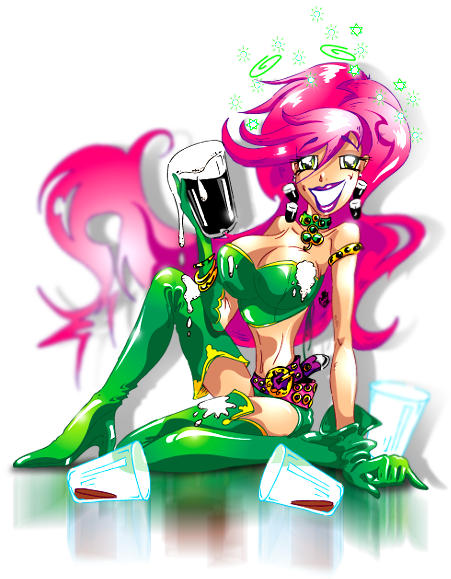
St PATRICK'S DAY PARTY
Night Club special night promotion - Flyers and Posters.

Anime, Manga, Deshok, Website design bournemouth
EASTER BUNNY GIRL PARTY
Night Club Fancy Dress Party - Flyers and Posters.

Anime, Manga, Deshok, Website design bournemouth
MISSFIT PROJECT - the S.H.E. / Natalie
On-line graphic novel character development.


Anime, Manga, Deshok, Website design bournemouth
MISSFIT PROJECT - the S.H.E. / Nadia
On-line graphic novel character development.


Anime, Manga, Deshok, Website design bournemouth
MISSFIT PROJECT - the S.H.E. / Nina
On-line graphic novel character development.


Anime, Manga, Deshok, Website design bournemouth
MISSFIT PROJECT - the S.H.E. / Rachael
On-line graphic novel character development.


Anime, Manga, Deshok, Website design bournemouth

MISSFIT PROJECT - Lusoona Karmoine (Lucy)
On-line graphic novel character development.

Anime, Manga, Deshok, Website design bournemouth
MISSFIT PROJECT - Druid F.L.M.D (Front Line Morale Destroyer)
On-line graphic novel character development.


Anime, Manga, Deshok, Website design bournemouth
MISSFIT PROJECT - Adam
On-line graphic novel character development.


Anime, Manga, Deshok, Website design bournemouth
AMANDA - The TranAm girl
This illustration created for a life-size, free-standing form cut board.


Anime, Manga, Deshok, Website design bournemouth
HAPPY 22nd BIRTHDAY NATS!
This illustration created for a birthday card.


Anime, Manga, Deshok, Website design bournemouth
EUROPEAN CUP 2008
This illustration created for a life-size, free-standing POS board to promote EURO 2008 events.


Anime, Manga, Deshok, Website design bournemouth
GEN, GENIE OUT OF THE BOTTLE
Heigh Steet retail POS, promoting large format full-colour printing.

Anime, Manga, Deshok, Website design bournemouth
FAITH SHOES - Height St brand
High Street shoe brand POS, swing tickets and other similar items.

Anime, Manga, Deshok, Website design bournemouth
THE RUGRATS - Nickelodeon
Branded merchandise for the toys industry. Sold via Argos, Great Universal Toys R Us and other big brand retailers.

Anime, Manga, Deshok, Website design bournemouth
TINY TOONS - B MORE BIZ
Personal improvement and self-help on-line program mascot.


Anime, Manga, Deshok, Website design bournemouth
TINY TOONS
This one is just for fun!

10 July 2015

THE ART OF THE SELLABLE HEADLINE


Here is a question for you, what does your company do?

Can you tell me? have you taken the time to think about a snappy answer to a question that we get asked all the time?
If you can then you have sellable headline for your company.

In business it can be the smallest most unimportant things that can make the difference:

There are many important assets a company needs but one that is so often over looked is the sellable headline.

The sellable headline is simple, short paragraph that describes your company and is very usefully for pitches, dinner parties, exhibitions and all those other "And what do you do?" moments. The Sellable headline is not to be confused with a strapline or a tagline, a slogan or a moto. Here are some instances of what a sellable headline is NOT:

TESCO "Every little helps".
VODAPHONE "Power to you".
AUDI "Vorssprung Durch Technik".

And my personal favourite from a TV campaign about a million years ago;

RADIO RENTALS "You'll be glued to our sets not stuck with them".

Straplines and slogans etc can be temporary and for the purpose of an advertising campaign and helping customers to remember a brand. What we are discussing here is a short, pithy easy to understand description of your company.

FOR INSTANCE

My company is a digital agency and we design and build Internet based systems that can help companies in the defence industry to communicate better with their clients and with other business. Lovely but this doesn't get to the point and doesn't tell people what we do in a way that is easy to understand and quick to get across, our sellable headline therefor is; 

"Deshok is a Specialist website & digital design agency for Aerospace, Defence & Security sectors U.K."

OK not so pritty but it doesn't have to be this is not a slogan it not a catch phrase but in many ways more important, it includes what we do, the benefit, who should be interested in the service, where we're from and where we like to do business. We use this everywhere from our website to our business cards to email signatures, and without playing games and being clever, it makes it easy to understand, it doesn't make people feel stupid it just tells people what we do.

Being able to describe what you do seems like a simple thing until someone asks you to do it. But why does it matter?

WINNING THE PITCH

In the process of my job I have meet a lot of businesses old and new and it is imperative that I understand what the company does other wise how can my company build a website for instance that informs the visitor? Quite often it would be easy to come away from a client brief and be none-the-wiser as to what the company does. This is usually because the company owner knows the business inside out, they know them selfs exactly what the company does but just can't describe it a way that anyone else can understand. So in my case, if not careful it can lead to a poor website design, probably leading to a lot of work to put it right, or in a more extreme case not being able to get an angel invested, not winning the pitch for next stage of your business start-up development.

NOBODY APPRECIATES ME!

I have a friend who works in banking but beyond that no one, not even his wife knows what he does. The other evening he said to me that nobody appreciates what he dose, I told him it was because no one understood what he dose to be impressed by it, and he still couldn't tell me what he does : )

The sellable headline is a small thing to fix and perhaps for this reason no one really discuses it, it's not that important until it is critical.

SO HOW TO SORT YOUR SELLABLE HEADLINE

4 simple rules;

1. Who you are
2. What you are
3. The benefits 
4. Where you are

So in the case of my company:

Who you are - Deshok website and digital design agency
What you are plus benefit - a specialist service for aerospace, defence and security 
Where you are - U.K.

THIS IS IMPORTANT

This is worth thinking about and having it prepared in your mind for when it is need.
It can simply mean the difference between getting the deal or not. Unbelievably as small as it is, it can be that important. You can use it as much as including it on your business cards or as little as simply having it prepared, in the forefront of your mind; for when the interested ask... What does your business do?

Well now you can tell them : )


CtA - LEAVE A COMMENT, COME BACK SOON.


Deshok is a small but well informed digital agency
very capable of delivering big things on a global stage.
To find out more about Deshok visit: www.deshok.com

When you're ready, CONTACT Deshok and let's talk about
where you want your business to go next.

CALL: +44 (0)1202 388538 - EMAIL: info@deshok.com

9 July 2015

SOS LYNX.ORG: TO RAISE AWARENESS FOR THE PLIGHT OF THE IBERIAN LYNX

THE HOME PAGE. EVERYTHING YOU NEED RIGHT FROM THE HOME SCREEN.
PORTUGUESE VARIANT

- BRIEF -

SOS Lynx.org is a Portuguese organisation whose mission is to raise awareness for the plight of the Iberian Lynx. At the beginning of this project it was estimated that only 150 Iberian Lynx were left in the wild; the boys and girls at SOS lynx wanted to do something about that. Initially the brief was simple: tell the world, raise awareness and collect lots of donations.

- THE GOAL -
Apart from raising awareness for the terrible drop in the wild population of the Iberian Lynx over the past 20 - 30 years, what did SOS want to achieve? The main reasons for this decline were already known, but a plan of action needed to be decided and then acted upon. Although this is beyond the scope of this case study, a captive breeding campaign was initiated alongside government lobbying with regard to Cork producers, and land was set aside to reinvigorate the rabbit population (rabbits being favoured prey of the Lynx). Also a hearts and minds campaign aimed toward local farmers was established to create habitat corridors in the hope of connecting up isolated populations separated by human encroachment.
SOSLYNX PRINTED ASSETS. PRESENTATION FOLDER, STATIONERY, BUSINESS CARDS

ASSETS REQUIRED

• Corporate ID
• Stationary
• Business cards x 4 types
• Corporate folders
• Merchandise designs
• Website (Awareness & Fundraising)

- THE BRAND -

The brief for the new brand was a list of things it would need to do, as opposed to the message we wanted to send, the goal we wanted to achieve or the emotions we wanted to evoke. The wish list was long and technical and would not be possible with one logo, but versions on a core theme would do the trick. The logo needed to include an image recognisable as the Iberian Lynx. It needed to work in full colour and black and white, in print as well as online and lend itself well to big promotion, exhibition materials, posters, promotional items and clothing. So this is how it was to be used, but what did it need to do? Firstly it needed to attract the attention it needed to inspire interest and sympathy. This would then lead on to the wider mission; to create awareness, encourage donations and for people to sign a petition or lobby an MP.


SOS BRAND, 1ST  FULL COLOUR, 2ND BLACK & WHITE POSS
The logo, incorporated within various promotional materials would ultimately lead interested parties to the website where the rest of the work could be done. It was at this point that the organisation became known as SOSLynx.org as opposed to plain old SOS Lynx. This was a small modification, but one that was cutting edge at the time - basically making the logo the domain name and the domain name the logo.
This logo was crying out for a motif to really hammer home measure. We opted to steer away from the sympathy or cute vote and decided on an image that was dynamic, majestic and purposeful. This was an animal on the brink, but which was not going to take it lying down; it was going to fight for its existence. 
The motif was based on a favourite photograph that had already seen plenty of PR action and therefore already had a strong recognition. The logo motif started with this photograph and was then traced by hand to create the 4 colour spot logo. This was vector based artwork so the logo could be resized and used for everything on the client’s wish list. After this a greyscale version was produced as well as simplified positive and negative silhouettes. Just 4 versions of the logo created in an ultimately scalable format, fulfilled the client’s criteria perfectly.

- CONCEPT / THE CREATIVE SITE -

By now we were quite attached to this project and the people running the organisation, so we decided to put a little more time and effort into this project than was budgeted for.

WEBSITE REQUIREMENTS:

•Multimedia presentation
• Inform the world of the situation and mission 
• Prominent donations page powered by PayPal
• Information porthole for downloadable .pdf monthly updates, press releases and media kits
• Photographic Gallery
• Video gallery
• SOSLynx merchandise page powers by CafePress
• Animated introduction
• Doomsday countdown clock with dynamic calendar
• Dual language options, Portuguese and English

SOS NEWS PAGE PROMINENTLY FEATURING DONATION BUTTON
We decided to build an F/S (Fullscreen) enabled interface, this meant that no matter the size of the monitor used for browsing, the website would fit full screen. Considering the importance of the project this site was deliberately kept simple with key feature sections being easily accessible from the home page. A multimedia solution was developed and built completely with Adobe Flash which would give us the scope to fulfil the client’s wish-list and build a completely seamless experience including; sound, music, video and animation as well as eliminating the need to download widgets or open content in other browser windows or websites.


MEDIA HOME SCREEN FEATURING PHOTOGRAPHY & VIDEO GALLERIES
PHOTOGRAPHY GALLERY READY TO PLAY SLIDE-SHOW
On visiting the site visitors are presented with an animated introduction to set the mood and to divulge key information. This animation was actually extrapolated from the site and used during press conferences and played as a loop during TV interviews, both in the UK and in Europe. Particular attention was given to the gallery and video player. We had several videos to serve up and all are played in a clean and simple custom media player. Rollover the screen and the play button is revealed, rollover it again and the pause/stop button comes into view. The same media player technology was used to serve up the photo gallery. This included several additional cool functions, custom built just for SOSLynx. The Donation page is accessed via a very prominent link above the main content windows. This was designed to be easily accessible from every page. For the purposes of budget the PayPal online donation system was used.


ENGLISH HOME PAGE WITH WITH LINK TO PORTUGUESE VARIANT
This is a Portuguese issue, but interestingly the English version of the site was created first with Portuguese following after. For the purpose of budget and limitations of the technology with regard to the websites design and text layout this was built manually.

- THE RESULTS -

This website became a worldwide source of information on this subject and was featured in television interviews and magazine articles etc.  In one day SOSLynx received over 230,000 unique visitors and continues to generate online donations. We are very proud that this website is a multi award winning project, including 2 Website of the Day Awards.

LET'S TALK
ABOUT WHERE YOU WANT YOUR BUSINESS TO GO NEXT
CALL +44 (0)1202 388538 OR EMAIL: INFO@DESHOK.COM